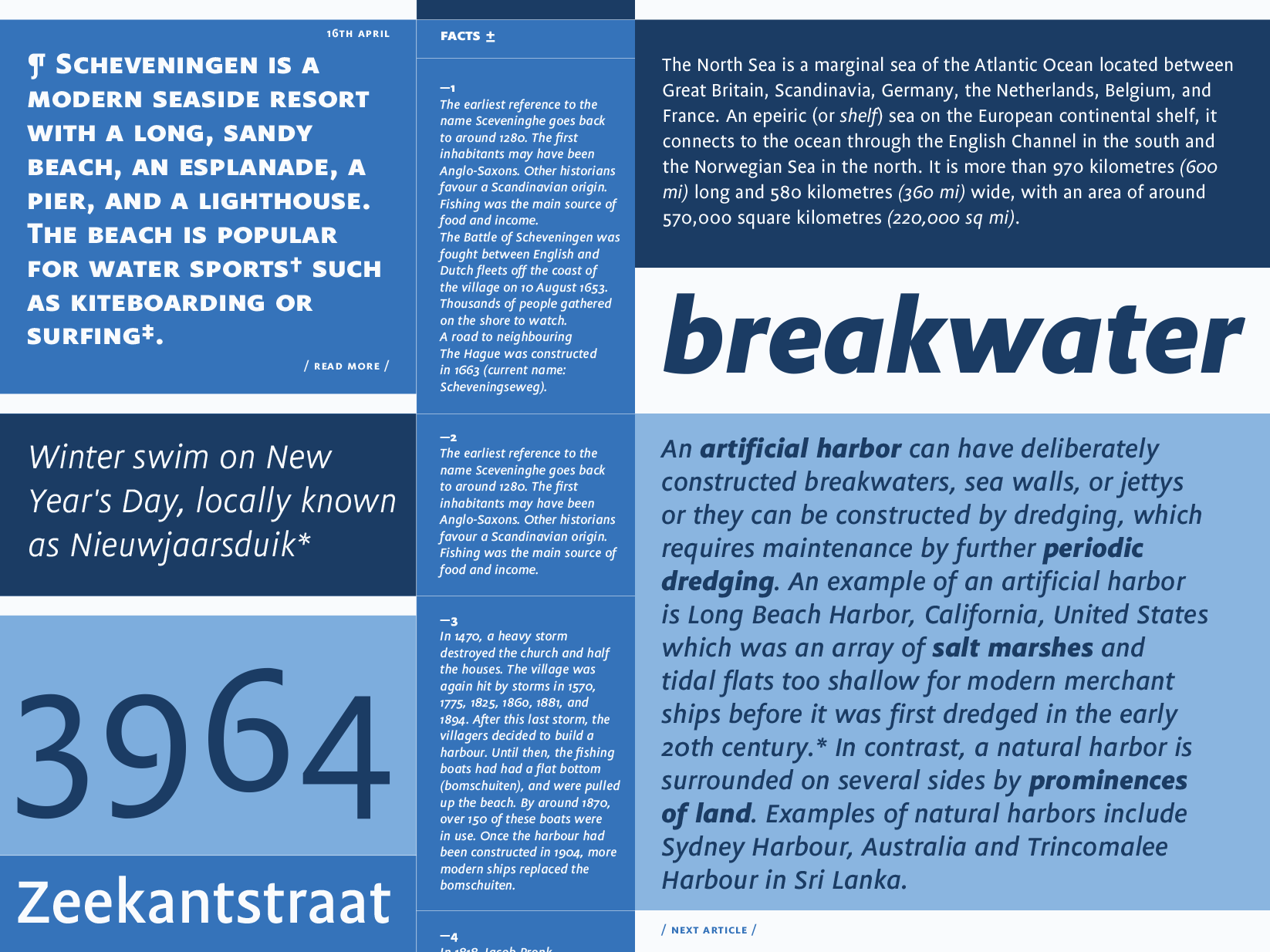
Flex started its life in 1999 as an attempt to develop a true multi-purpose typeface. Paul van der Laan wanted the family to be comprehensive and adaptable, with open letterforms to make it highly readable in small sizes. True italics, small caps, oldstyle figures and many ligatures allow for refined typography.
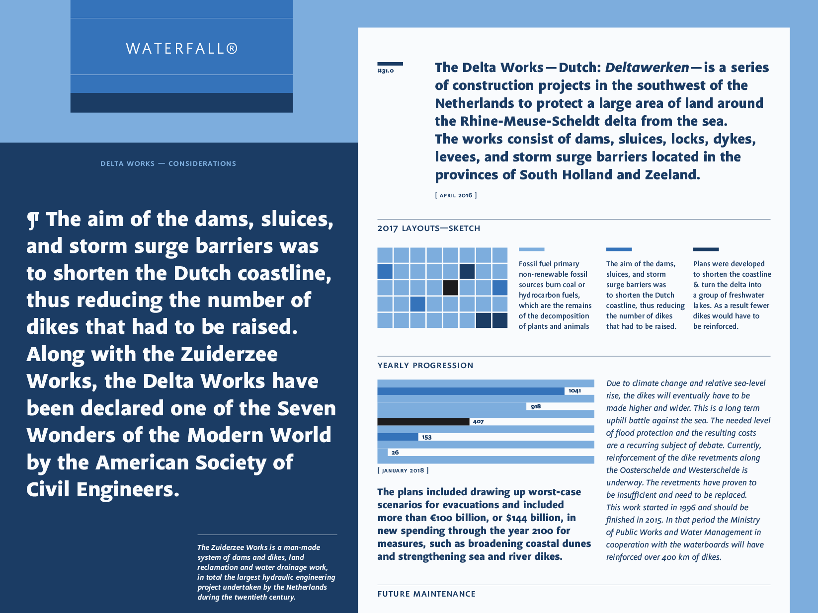
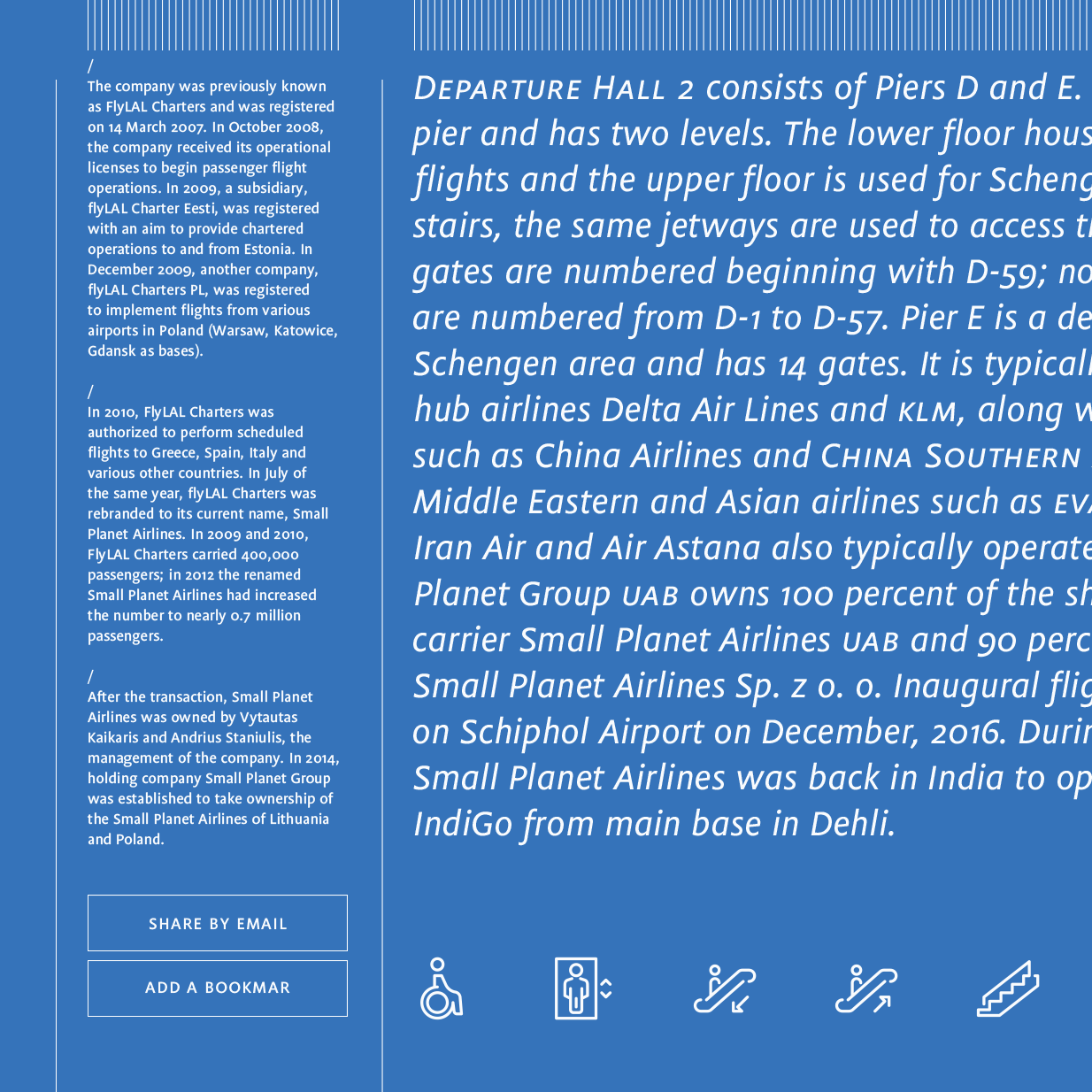
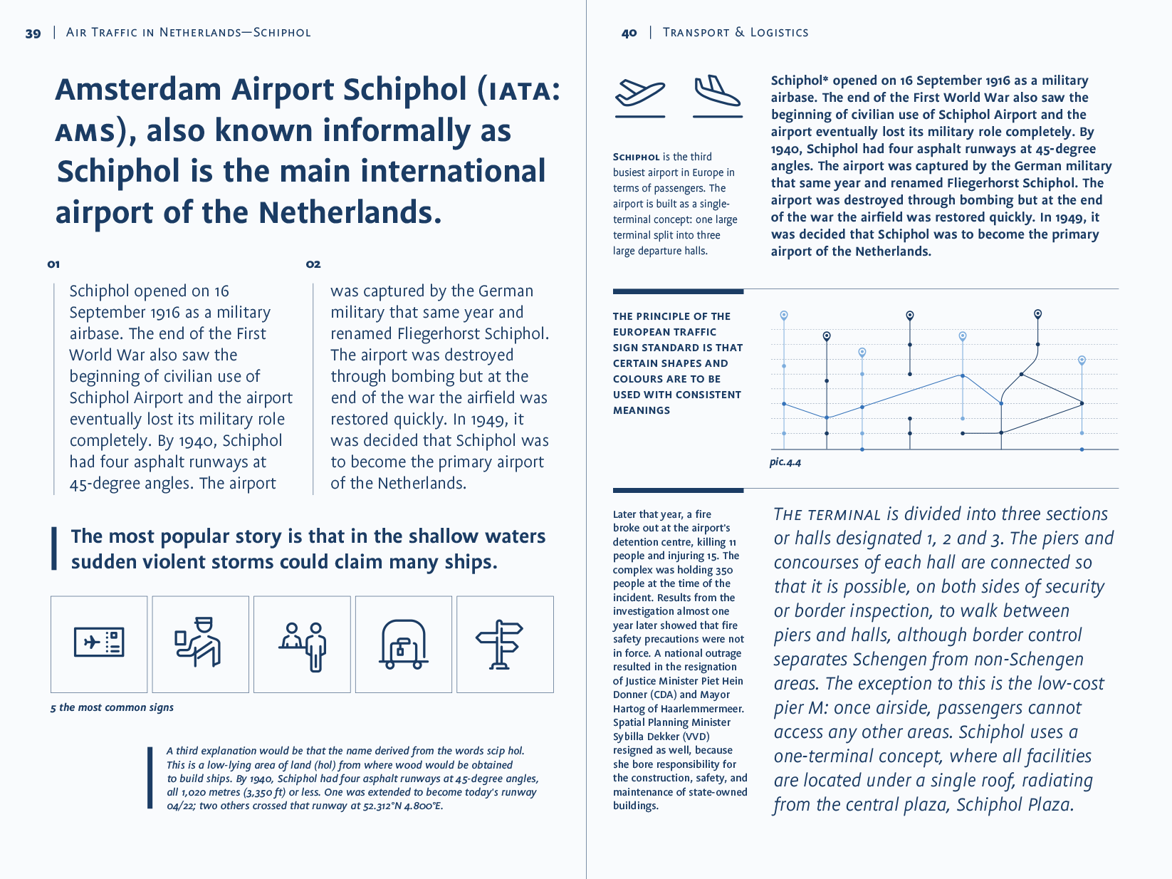
By giving Flex economic, space-saving proportion, it cuts an equally fine dash in larger sizes or bold headlines. The five finely attuned weights make Flex well-suited for signage and wayfinding systems where positive as well as negative text applications are common.
Designer
Paul van der Laan
1999
Flex supports the following languages
Afrikaans, Albanian, Asu, Basque, Bemba, Bena, Catalan, Chiga, Cornish, Danish, Dutch, English, Estonian, Faroese, Filipino, Finnish, French, Friulian, Galician, German, Gusii, Icelandic, Indonesian, Irish, Italian, Kabuverdianu, Kalenjin, Kinyarwanda, Luo, Luxembourgish, Luyia, Machame, Makhuwa-Meetto, Makonde, Malagasy, Malay, Manx, Morisyen, North Ndebele, Norwegian Bokmål, Norwegian Nynorsk, Nyankole, Oromo, Portuguese, Romansh, Rombo, Rundi, Rwa, Samburu, Sango, Sangu, Scottish Gaelic, Sena, Shambala, Shona, Soga, Somali, Spanish, Swahili, Swedish, Swiss German, Taita, Teso, Vunjo and Zulu.













 Loading your cart