


In 2013, we were approached by Wolff Olins to design a new type family in conjunction with Mike Abbink for their client General Electric. GE has already been using a custom headline typeface since 2002 — GE Inspira, also co-designed by Mike Abbink. This earlier typeface served as a starting point for the new family, which is tailored to the use in small body copy and on screen.
The new GE type series is comprised of eight styles: four serif and four sans-serif fonts. While the sans and serif families are clearly designed to complement each other, they hold their ground just as well on their own.
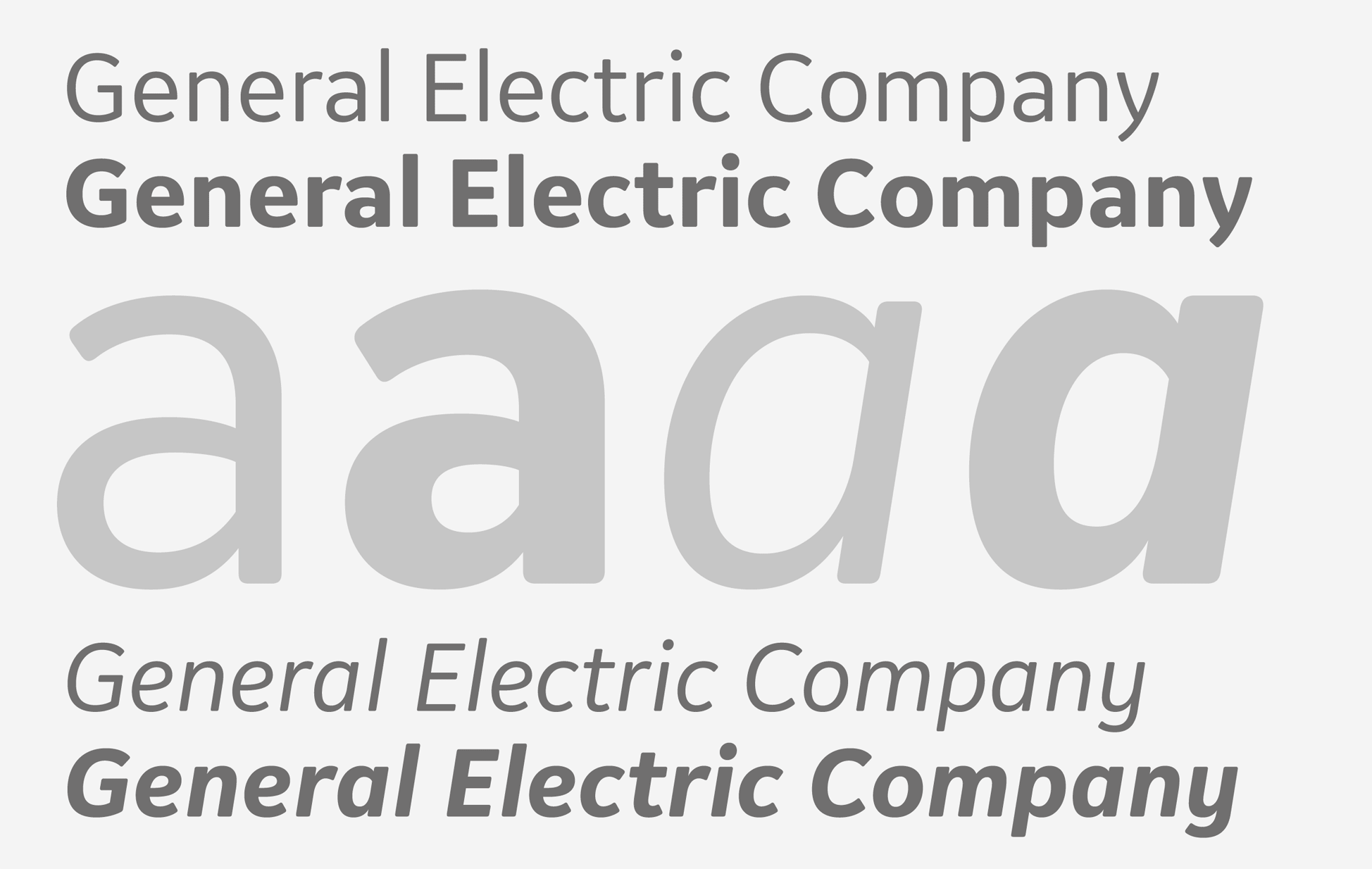
The sans-serif is a contemporary design with open apertures, subtle curved details, and slightly rounded corners and terminals. All four styles (Regular, Italic, Bold, Bold Italic) are optimized for use in the smallest sizes — e.g. in labels, listings or tabels — as well as clear rendering on low-resolution screens.
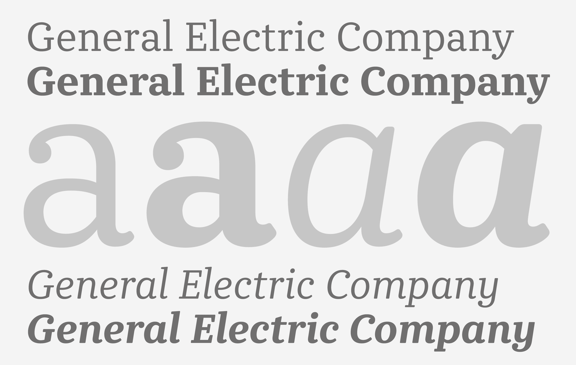
The serif family follows the structure of the sans-serif but, furthermore, takes inspiration from the Clarendons of the 19th century — a nod to the time when GE was founded. It features a moderate stroke contrast, sturdy slab serifs, and prominent ball terminals. The slightly rounded corners help tie the series together and underline its handsome appearance.
The GE type family has received a Type Directors Club Certificate of Typographic Excellence in 2014.
2014
Client
General Electric Company, Fairfield
Art direction
Wolff Olins, New York